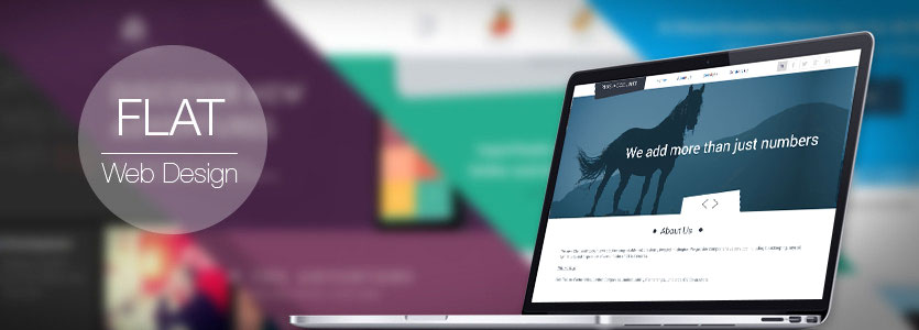
Almost Flat Design: What does the Future hold?
It is fair to say that flat design is a controversial topic in the field of user interface; although Microsoft gave flat design the big initial push, the masses have certainly followed their clear lead.
There is no doubt that flat design offers great aesthetics and is easy to make responsive; though some designers have called it a fad and other have bemoaned its usability.

A Solution to the Flat Design Debate.
Finding that middle ground in the field of website design should be the aim of website designers; they have a duty make the latest website design trends work for the user and make website templates look seamless. Google have managed this with their Gmail, Google Maps and Google Plus platforms.
Almost Flat Design and Gradients.
These types of interface do tend to stick to the basic design parameters of flat design (i.e. no drop shadows, flat colours, etc.); however of closer inspection you will find slight variations such as buttons with slight gradients; subtle differences, but perhaps they give it the edge over truly flat design.
Almost Flat Design and Drop Shadows.
Depth is not ignored in this approach; it is used in a minimalistic, subtle way to support understanding in the user. Gradients can be used in the same way; but subtlety really is the word.
Almost Flat Design in Other Platforms.
The new MySpace has clever use of gradients in its buttons and Facebook, which you tend to think of as gradient free, uses drop shadows in strategic places such as to demarcate the separation between overlays and dropdowns from the remainder of the ads, posts and other items on their pages.
The Future for Flat Design.
Flat Design and Almost Flat Design definitely have their place in the world of website templates and website design; they may be a web design trend, but their widespread use shows that they are at least popular. One thing all designers must remain cognisant of however is usability; the user must be kept at the heart of every design.